
Mother Design
Mother Design on why packaging is the only thing a designer can say to the customer
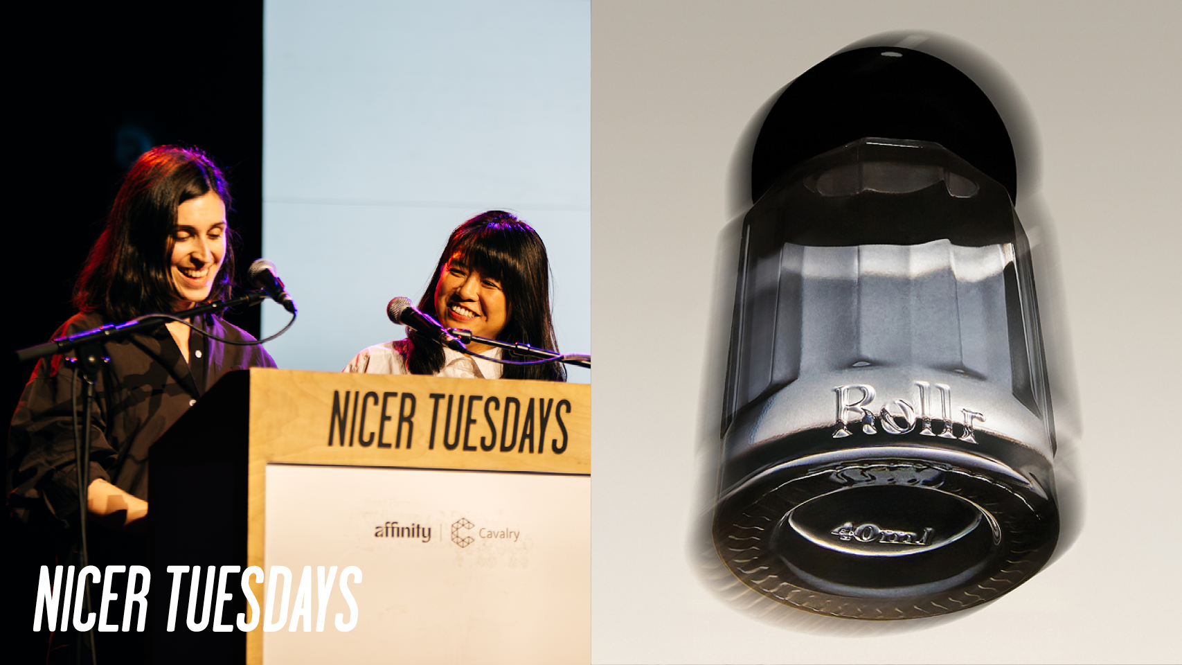
“As more life happens on screen, the physical moments that you have with a brand matter even more. Packaging is often the only three-dimensional thing that a person gets to interact with.”
Okay. So, I'm George and this is uh Cecilia. Yes. From Mother Design. Um, as Jenny said, you probably have heard of Mother because of all this amazing advertising. Uh, renowned the world over over classic ads for IKEA, KFC, and they gave PG tips, that famous monkey. But what you might actually not know is that Mother are a constellation of companies. They range from a PR agency to original content and a startup incubator.
Um, so at Mother Design, we're a group of 30 across London, New York, and LA. Some of the London team is here somewhere. We love you. Um, so funnily enough, George and I are not in this beautiful picture. We're both out in maternity leave. Uh, not offended. It's all good. Um, so here's some of our work ranging from the brands that you might know like M&S, BBC Sound, Selfridges, etc. to some that you may not know like Ozen, Roller, uh, and Kora. So we stretch from high street banks to hypnos hypnotism apps. And we cover everything from strategy, visual identity, art direction, packaging, motion, product design, and brand experiences.
So, but what you might not know about us is that we actually do a lot of packaging. It's become quite a big part of things that we do. And it turns out we like to spend a lot of time thinking about boxes, tubes, and bottles. Chapter 2: The role of packaging So why? Um because as more life happens on screen, the physical moments that you have with a brand matter even more. Um packaging is often the only three-dimensional thing that you ever that a person gets to interact with. And then there's also the lipstick effect.
So times are getting tough. People are spending less. They're pulling back on those big purchases. uh but still those small affordable moments of pleasure and increasingly they're finding it in the grocery aisle. So even the boring categories like detergent, beans, toilet roll, they're all leveling up which means that the bar is stand for standing out is keeps getting higher and even the most unglamorous uh unlamorous aisles can now be quite exciting.
So we want to chat about the five lessons that we've learned so far about packaging. Great. So first one an easy one stand out. So when you think of packaging of course this is one of the first things that we think about how is it going to grab your eye. So this is first uh it's a probiotic soda and it doesn't necessarily look like one but that was the point. So this was first before the Chapter 3: Lesson 1: Stand out mother design rebrand. The founders that are a really nice couple spent about four years perfecting the probiotic technology and the formula. But in the meantime what happened was that the category really caught up. the category, sorry. Um, the visual cues for health in the category had been properly established and then suddenly everything
starting to look a bit the same. So, kombuchas, flavored water, vitamin waters, all these things that were very minimal, quiet, almost like ethereal in a way, and most people were playing inside the box, the metaphorical box, and it was a very beautiful one, but at the end of the day, it was the same one every single time. So, what we did was going the other way completely. So, instead of the usual calm, that's a good reaction. uh clean and quiet cues that are found in uh in these like healthy drinks that we were just looking at. We built something really loud. So furs has actually mood enhancing properties and
there was a real joy in the brand that we wanted to transmit through the branding. Um, so what we did was we took inspiration from traditional independent health shops like mom and pop health shop with like papyrus, you know, headline and like a label that was printed at home and then like proper traditional sodas, very colorful, bold, over the top. Um, so the logo and the secondary fonts that look like they came out of the 60s and the 70s referring to these kind of like old hell cues and then paired with gradients and shiny renders of fruit and dolphins because you know why not. Um, then every flavor got their own color, universe, and its own over-the-top names. And I didn't
want to say this out loud, but uh, pineapple, yuzuoria, and Dr. Cherry Happy Place are some of the names. Um, so the result, as you can see, totally maximalist on the surface, but every choice earned its place. And now it's the one soda can that you can't walk past. Chapter 4: Lesson 2: Strip back Okay. Second lesson is strip back. So after seeing first, you probably think the answer is more louder, brighter, add more dolphins. Um, but what happens when the loudest thing on the shelf is actually the wrong move. So this is Kora. It's a organic period care brand.
And Kora didn't have first problem. It had the actual opposite one. So the period care aisle is a place that people move very quickly through, very uncomfortably through. And once they found something that works for them, they very rarely switch. So this is your typical period care aisle. And so you can see that shouting louder with shouting louder than the competition wasn't actually going to fix that. It would have just added to the noise that nobody wanted to hear in the first place.
So we went the other way. So our concept was all about giving comfort through the uncomfortable. So the design was stripped right back. Um we have a bold logo mark which uses soft rounded letter forms. You can see the O is being comforted by the C. And uh someone said on brand new under consideration that it looked like the sea was drunk and leaning on the O. Still being supportive though.
Yeah. Um and then we stripped everything back, used generous negative space for clarity, which then supported the use of the color for wayfinding. So you can see all the packs are different colors depending on the product and even the tampons have different tones of that color to indicate the different flow. So it's incredibly intuitive.
Um, we kept the range really easy to navigate. We didn't throw away the short hand that people already trusted. Things like flow droplets or the shape of panty liners are super important. Uh, and we use tone of voice to do the rest. Always being reassuring, clear, and never sterile. And since launching, it support um it secured a spot in Target and was even upgraded to a upgraded to a prominent shelf. Uh, and that was the real win.
you know, getting people to trust something totally new in a category that's built for sticking with what you already know. Chapter 5: Lesson 3: Speak up Great. Um, so the third one is chewing gum. Um, sometimes, yeah, sometimes you'll have to launch something nobody's ever seen before with the challenge of having not a lot of resources or time to build a recognition before you launch.
You get one pack and about two seconds to explain what it is. So, how can you do it? Uh, this is nude. Uh, it's a plastic free, sugar-free, plant-based, and biodegradable chewing gum trying to fix a problem nobody even knew existed. So, well, the top is the previous running, the bottom one is ours. So, most people don't really wonder what is in their chewing gum. And until I worked on this, I I didn't really either. But the thing is that chewing gum has plastic in it. Like plastic like the supermarket bags. And to be very technical about it, that is gross. So our ambition was to make a brand and a pack that did a number of things at the
same time. So we had to educate the consumer about the plastic content in chewingham. We had to position the brand as a true challenger in the category and in the industry and the only sensible option. And we had to do it in a way that was appealing and friendly and not niche. Even though we were borrowing some cues from protest and we had a very bold mission, um we didn't want to alienate anyone. So there was no room for subtlety. every centimeter of the pack had to work really hard. So we had the maximalist approach on one side with the chunky black type and the almost like imperative tagline that tube plants
not plastic. H and that brought a lot of high energy and boldness and then on the other side we had the vibrant colors and the playful logo and a mascot that you could probably see in one of the other images that make it feel a lot more approachable. Um a little bit more on the colors and the logo. So uh I guess these are some of the learnings. Um, sometimes we think it's good to move away from category cues to be the challenger and to make some noise. But sometimes it's really wise to adhere to them. Uh, in our case, the color cues in chewing gum are very very established.
Um, so it didn't really feel necessary or even right to challenge them or to change them. So we just up the vibrancy a little bit to bring them in line with the rest of the brand. And in terms of the logo, uh, that looks like a mouth. Hopefully you can see that. Uh, in ancient Greek mythology, the goddess of the mouth. Oh, it's a joke. Uh it's chewing gum. So you chew gum with your mouth. And sometimes the obvious thing is actually not the wrong thing. So it's a mouth. Uh it worked. It got snapped up by weight roast. Sales grew 900% in a year. And in just that one year alone, you'd kept the equivalent of 3.75
million plastic straws out of the world. Thank you. Um the next one is step up. So what happens when packaging isn't just working against time, but it's doing it completely alone. So in this case, no Chapter 6: Lesson 4: Step up shop, no ads, no wider brand world to lean on, just the object doing every job at once. So this is Roller. It's a refillable deodorant and it has no shop front and no campaign. It's sold direct to the customer, which sounds simple, but it means that there's no shelf to stand out on and no ad to build that brand story first. So it's just the deodorant and the moment that someone actually holds it.
Um, Roller's whole thing was why should feeling good come with a catch? So, they didn't want you to have to choose between indulgence and the guilt. They wanted you to feel good using it and then feel good about using it. And there's nowhere else for that idea to go. It all had to live on the bottle in one in on its own.
So, every detail had to earn its place. The weight of the glass, the finish of the cap, and the small ritual of clicking the new refill rather than throwing the whole thing away. Um, everything was inspired by the product. itself. So you can see um actually it's very small here but the logo um it's big there. The logo hints at the fluidity of using the roller uh and that language was used in supporting the graphic navigation that you can see on the refills.
And their founder put it best that every part of it of it from the bottle to the brown world has to feel as good as it looks. And when the pack is the only conversation you get to have with someone it has to say all of it and say it well. Great. Um, so this is the last one of the five. Um, what if you're designing thousands of packs instead of one? How do you make a packaging system that can Chapter 7: Lesson 5: Get it done flex across a lot of different types of products and still feel coherent? So, this is M&S. You already know this name.
And we had the major task and pleasure of redoing all of their homeware and lingerie packaging. So when you're selling across approx 5,000 products from multiple departments, it's really tempting for the teams to try and give everything its own identity uh to help it stand out. So it makes sense, but then you got so many of them that nobody really can tell what the main brand is anymore. And that's what was happening to M&S. Um also part of the problem, this is a shop, uh was practical. So M&S, some of you may know, has very limited staff on the floor. So the pack had to carry a lot of the weight when it came to informing the consumer. So gradually what happened was that the
packaging started adding more and more and more. So more claims, more information, more detail and that really didn't help. So the consumer was very confused and the brand was kind of diluted or all over the place. Um so this is what we did. We stripped it all back and created a system that feels really confident, really proud and very very clear to navigate. We didn't let the functionality aspect of it get in the way of the style. We propose some really beautiful finishes that the team uh has gone through um on the boxes that really elevate the user experience. Um and we think we like to think that we brought home and lingerie in line with M&S fashion which is in its golden era.
You can quote me on that. Um but it wasn't simple. So M&S like we just said has a wildly huge range of products something like 5,000 maybe between home and lingerie. Uh all different materials uses coming from different countries, factories etc. So the system really needed to have the flexibility to allow for different kinds of informations and different amounts of information. So there was this example where in the previous packaging there was um they used to have a space for the descript descriptor line and it wasn't optional that it always had to be there and this meant that there was a whisk uh that was being sold and on the label said good for whisking which is true but probably you don't need it on the pack.
Um, so yeah, this was a very different kind of project and a really interesting one because a really big part of this project was to u edit out and cut out rather than adding new things. And as it usually goes, it's a lot harder sometimes to make something really appealing and really engaging with less elements to work with.
Okay, fun fact for you. Did you know that one in five women have a pair of M&S pants? Um, so M&S is the biggest range of underwear in the UK. And if you've ever if you ever been to the lingerie department, you know how overwhelming it can be just to find the right shape of knickers. So for lingerie, it actually meant going softer, warmer, and using a tone that guides you rather than shouts at you.
Because to be honest, choosing lingerie is very different from choosing a dinner set. So most of the time, the answer was just to get out of the way. So when you're trying to choose a bra, the product's already in your hand, and you just need the packaging to tell you the right information, nothing more.
So, two different categories, same underlying job. Every pack, whether it's a duvet or a bra, had to do something more than just sell the thing inside it. It had to remind you why you trust M&S in the first place. One system that actually knows what to tell you and when to shut up. Chapter 8: Conclusion And so, yeah, these are our five lessons that we've learned so far. Uh, and of course, there's no one solve for packaging. You've seen five completely different problems with five completely different answers. loud versus quiet, explaining versus disrupting, carrying a whole brand alone, or holding a name together across thousands of products.
But underneath it, underneath it all, the same rule kept showing up. Distinctiveness on its own is never the job. Every pack we've shown you today had to solve something, a real problem for the person in front of it. So, it not didn't just have to look good while doing it. So, that's the bit we keep coming back to. Not what the packaging looks like, but what it's actually there to do.
Thank you. Thank you.
Latest Talks
-

Lily Kong
How painting offers self-discovery and connection with memories
Watch -

Alfie Whiteman
From professional football to photographing toe wrestling
Watch -

Jazz Grant
Using mixed media as a narrative device for dual heritages
Watch -

Daisy Chain
Reimagining Crack Magazine with slime-inspired 3D motion design
Watch -
Kelli Anderson
Tactile typography and graphic design as fine art
Watch -
Noble Signs
Restoring NYC’s storefront signage through graphic design
Watch