
Noble Signs
Restoring NYC’s storefront signage through graphic design
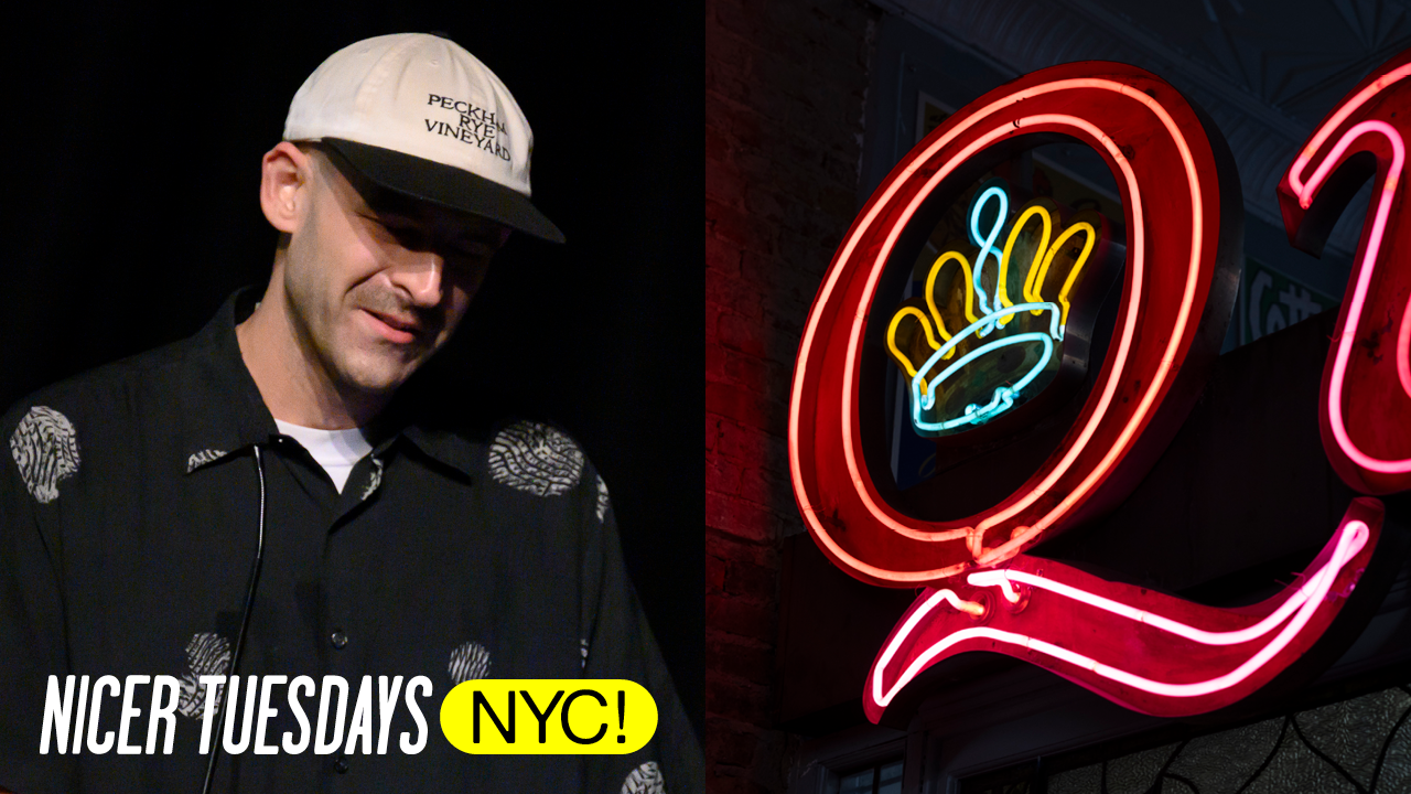
“Preserving local vernacular for us is not just about nostalgia. It's about being stewards of something greater, of our shared memories and our irreplaceable collective culture.”
Um, thank you to It's Nice That for having me here tonight to talk about a topic very near to my heart, New York City signage. I love talking about what makes New York signage so special and unique to me and how that informs the work that we do, both with our studio, Noble Signs, and our nonprofit, the New York Sign Museum. Noble Signs Inc I started designing and learning to paint signs in 2010. And from the beginning, I tried to locate that practice in response to the visual culture of New York City. Back then, I could already see that the signs that made New York City so special and unique that represented that visual character
of the city were quickly disappearing. I tried to have Noble Signs act as a counter to this. If we were going to be putting work into the New York City streetscape, I wanted to design it with context and respect for our local area. Sometimes that could mean exercising self-control to design not trying to reflect myself, my own personal interests, but more with a universal lens to capture some of that iconic style that was already vanishing around us and to multiply it back into the streetscape. A vernacular is the native language of a specific group of people.
And there's a visual vernacular to New York City signage and 20th century lettering, an aesthetic we can tie at the specific place in time. Pronaculars are learned locally, not in a classroom or from books. Uh, many sign painters came up through apprentice systems, studying with an individual painter or as part of one of the many sign shops in New York. Others were just self-taught and pulled their inspiration from the urban environment and the world around them.
But despite these diverse backgrounds and skill levels, these artists were producing work that had certain shared qualities. Bold lettering, primary colors, alphabets designed for speed and maximum impact. The work needs to be produced fast and it need to stand out in the crowd and you needed to be able to read it. So with Noble Signs, we set out to study this vernacular to decode what made it resonate with us so deeply Noble Signs Inc on a personal level. And to answer that question, what is this New York style beyond just you know it when you see it?
What defined that aesthetic and feel of this old New York, the one that I pictured in my mind's eye? And what made it so special and unique? This has gradually become the center of our design practice for the last 15 years and Noble Science has grown into a team of 15 people. Designers, artists, archavists, and crafts crafts people working together to keep this local style alive in our streetscape. We have a research based approach that looks to the layered history of the world around us to steward the New York vernacular design and sign tradition into the future.
As an extension of this mission, we established the New York Sign Museum in 2021. It's a nonprofit archive, gallery, and living art project dedicated to preserving and educating people about the city's lettering, advertising, and signage traditions. Housed in our East Brooklyn studio, the museum now hosts public tours, lettering workshops, and community events that reconnect people to the visual identity of the place that we live. Here you can see some some of our signs that we've saved in the last couple years. Really proud of the work that we do, saving signs. And I think this image uh from Barry Corkstore in
Bensonhurst, Brooklyn, really shows why this is so important because there is so much layered history all around us. And it's not uncommon that we take down an old sign and find an even older sign behind it. Um New York is full of history and it's really easy for it to go unnoticed. And a lot of this work that we save is stuff that was going to end up in the in the garbage. Um, here's another sign that we saved in 2024 from Times Square, Smith's Bar. And these are just a few examples of our growing collection of over 200 historic storefront signs. But tonight, I'm here to talk about design and the visual
vernacular of New York and how that relates to our work. The streetscape around us shows a shared respect for restraint. In New York, we don't like to waste each other's time. So, our style is direct. It's playful, but it's inviting. It makes us feel like we're home. And that feeling means something.
It's what we're trying to capture in our work with Noble. Our mission as a studio is to create storefronts, brand identities, and artworks that speak to history and the present moment. We want New York City to continue to have a unique visual identity. And by keeping these local styles alive, we hope to create the positive effect in the place that we live and work. Our work extends beyond signage into branding, type design, strategy. But tonight I am really going to focus on our sign design practice and how it interfaces with uh our collective history. Our ways of working are pretty unique. Um I think although most of our designs are lettering based, we rarely use fonts. We
try to draw out our letter forms by hand and then scale for production from the pencil sketch. In this way, we're able to channel a bit of that vernacular into our work in both inspiration and application. The designs are inspired by history, but they're also created by hand. To maintain that human connection that can only come from a person, I think when you see something made by hand, there's that idea of unseen effort, right? You might not notice it consciously, but subconsciously you respond as a human to those imperfections that make you know that it was made by another human and in this case by your neighbors. So while we do
recontextualize reference points into new cont concepts, sometimes we are just so inspired by a classic storefront, we try to find a way to directly link it to a new project. It's our way of continuing a thread that was abruptly ended and bringing a friendly design ghost back from the dead and giving a new life with a business a business that's positioned for the present and the future. Um, this is a a collector's story here. This is a sign that um I saw on Facebook Marketplace a few years ago and it is just such a great sign. The the museum is a nonprofit, so we're not usually in the business of buying signs.
Um nor can we afford to, but this one really it it speaks so clearly to the New York style in so many ways. And we talked about it or like, okay, we're going to make an offer and by the time we did, someone had already bought it. that sort of sticks with you as as a I mean I think a lot of designers we are collectors so we all know that feeling of having some object that you coveted and it got away from you but it stuck around um in my mind and we had an opportunity a couple months after that happened to design a sign for a city council member Justin Brandon who basically was like do whatever you want.
Um, so I thought of the simple service bookshop sign and uh I kind of pitched him on that idea. Um, what if we just kind of flip this and do do the Justin Brandon version of this? Um, and it was going to be a sign for his um for his like neighborhood office in Coney Island. So luckily he was on board and we got to sketching. And here you can see a bit of how we approach uh signage design. Um, it always starts with a pencil sketch. Um, we do draw small and then scale up. Um, we like to show people when we're working with clients on a signage only project. Um, we like to show them a pencil sketch and then um show show colors and and options for how it might come to life um in this way
that you see um at the right. basically showing a sliver and leaving the pencil sketch mostly exposed. So, you know what you're going to get, but you also kind of have to use your imagination. I think like that type of process, which is really how signs were pitched, you know, in the pre-digital era. I think it engages the client a bit more with the process and lets them know that the thing that they're going to be getting is truly made by hand. And it also allows us to get to the end result quicker, which is important when you're making signs because it's New York and every Everyone needs their signed yesterday.
So that said, once we have uh approval on the direction from a client, you know, we're not let it. We want to create the work as efficiently as possible to offer at the best price so it's accessible to as many people as possible. So we do vectorize, but the vectors are often not shared with the client if they're um just getting assigned like this. So you can see how we take a sketch from inspiration to a pencil to color up all the way into vectoring. And the vectorzation process is important because our work is large format. And even if you draw the sketch by hand, it's it's more effective to vectorize and scale up digitally than it is to try to draw it out at scale by
hand. So uh we vectorize internally and then we use that to produce full scale patterns that we then run through our process which is really very much um true to the way that these signs have been made for over 100 years. Uh we use what's called a pounce method because an ASMR here. Pouncing is basically um perforating uh a paper pattern um with tiny holes.
You can do this with a little cutting tool. Uh we have an electric uh basically like a magic wand that shoots electric sparks through a piece of paper. But what you're doing is creating uh perforation that you can then put chalk dust through that serves as a guide for painting. Um we mix uh enamel paint custom um custom colors to spray for backgrounds and for lettering and then we paint it by hand. And here you can see the sign in in process. I I love this picture because I think it really shows the scale. And I think one of the things that's really exciting to me about the work we do is the scale and how it's going to live in our streetscape in such a big literally big
way. And then here you see the final product in Sichu. Um really proud of this sign and pleased to say that it was just honored with a TDC award this year. Um [applause] it's it it's it's not necessarily the type of work that you usually see um in those competitions and I felt like it was a long shot to be honest with you.
Um but it was it was one of the signs we made in the last year that I was the most proud of and you can see some of the details and in this case these small inset panels we um while we vectorized the um I'll just jump back. While we vectorized the the hero lettering uh Councilman Justin Brandon, we left these small panels um as just uh blank fields and then uh we did freehand lettering to put this um call the number and Coney Island's voice in city hall. freehand lettering um is, you know, you let the brush really dictate the forms and you're able to create lettering that feels spontaneous and has so much
personality in hand, but you can't really do it at like 10-in tall letters. It really only works when you can use the width of your brush. So, this is a great opportunity to kind of mix what we call builtup lettering with freehand lettering in one sign, one composition. This is another sign that we uh did in the past year for Radio Bakery in uh Prospect Heights, Brooklyn. Uh this was a great one because they came to us with a reference um of a sign that they had loved and lost uh Glazer's Bake Shop, which was in uh upper Manhattan for I believe like 70 or 80 years. It closed just a few years ago. And I mean, what a beautiful sign. Um this is what we call
trim cap lettering. They're uh acrylic or vintage plastic letters that are banded with a a trim. So, it gives them kind of a dimensional look, but you can still do the whole process by hand. And um it was like a way to give a little more punch to signs when um previously maybe they had just been painted and then acrylic and plastics came around and it was it was just a nice uh dimensional approach that could be done pretty efficiently as long as you had the skilled trace people who could bend the letters. Here's another one um where you can see inspiration into a final product. Uh this is a sign that we made for Vulca, one of my favorite businesses
I've been going to since I was a kid. Um we actually cold called them when we heard they were opening a second location in Brooklyn. and we went through a lot of iterations with them, but ultimately came around to this idea inspired by the Clover Deli sign, which if you're not familiar with it, was um a really amazing uh mom and pop shop in East Midtown and had unbelievable signage. And although this isn't quite as direct an inspiration, it has its own color palette and uh you know some some unique things that separate the two the the reference from the the final product. But you can see the inspiration both in the typography in the lettering in the V and also in the construction.
This is like what we call a raceway sign with channel letter neon. And it's a unusual uh style. Usually the channels are applied to the front of the raceway, but this Clever Deli sign both had lettering on the front and rusting on the top of the raceway, which we thought was just super cool and it was uh something that we're really happy to be able to bring into this project and it brings a smile to my face every time I drive by it on the BQ8. So, we hope that by reconnecting that tie between design, manufacturing, we can create physical objects that are really grounded in humanity. And I think there was a time not so long ago when artists, designers, and crafts people were working more in
active collaboration. And this connectivity between design and production, the thinking and the doing and the two arms working together, these people were able to create things that are really so spectacular they are hard to imagine making today. So by bringing design manufacturing back together in one physical space like we're doing at Noble Signs, we hope our work can touch at that and hopefully Noble Signs Inc find a way to elevate those little details that turn something mundane like a sign into something that really catches your eye. Here you can see just that awesome moment when you finally light up a massive neon sign that you've been working out for six months.
This was for Robera's uh Penn Station across the street from Penn Station. Um, which also brings a smile to my face when I walk up the stairs to see the next play and I see it from the window. So, from a design perspective, I think there's a lot of qualities that inform the New York style that we try to bring into our work, but maybe the most important is a clear subject forward emphasis and a focus on legibility. When we look at this LG meat market sign, we know instantly what the business sells, meat.
You don't really need to know or really care who LG are. I think the sign tells you everything you need to know. And there's a certain humility in that that in a lot of ways runs counter to our current culture. And there's a real case for why it matters and is worth reconsidering. In the post Apple world, I think it's very common for not just signs, but whole brand identities to not tell you what they are or what they do. um subject emphasis has been replaced with brand emphasis and now everybody has a logo and a brand even your corner coffee shop.
When those design decisions were left to sign makers as they were in the pre-digital age, there was a clear consensus on what the sign should do, communicate a message. So the best sign for a coffee shop was one that said coffee shop. Uh when did we lose the plot here? Uh how do we end up with coffee shops that look like this?
That's fire. [laughter] But I think there's a certain decency in telling people what you do in such simple terms. It creates to me a feeling of inclusivity. When the sign says restaurant, you know that if you're hungry, you should go there to eat. All are welcome and all belong. And this push towards more opaque identities can feel like a litmus test. Oh, you don't know what this place is? Well, maybe you should just keep walking. So in that way, the power of subject forward signage multiplies exponentially across a streetscape. When you have an entire avenue where every business is clearly communicating what it does, that starts to feel like more than just a street.
It's a neighborhood. And this is powerful. And I don't think it's truly lost today. Um, every New Yorker still knows that relief of walking into your local bodega at the end of a long day and feeling home before you even set foot in your own door. They're meeting places, right? Where we gather, we talk to our friends, we talk to strangers, and it creates community.
So, speaking to this crowd directly, what can we do as designers to help counter these trends and create positive impacts in our own communities? I think we can make work that honors the context of its setting and become advocates on the ground for preservation of local visual culture. I'm sure many of you have already undertaken this. the design community can keep working together to keep craft alive and keep our communities and streetscapes full of humanity, especially when we design work like signage. Um, it's going to live in the built environment. And I think there's a responsibility that we shouldn't take lightly as designers. Uh, people don't
really get to choose whether they look at a sign that you designed. So, let's make it for everybody. So I think whether you're interested in learning lettering or other handcraft or not, uh I think every designer could benefit from some direct involvement in the production process of the work they create, especially when it is something physical. As designers, there's a lot of lessons we can learn from these cra craft traditions and hyperlocal design.
Today, minimalism does remain crucial, but authenticity and warmth has become the most sought after value as a counter to an increasingly homogenized and mass-produced society. The rise of AI has only highlighted the importance of authentically human work. New York's design style, as shown in its signage, represents an ideal marriage of simplicity with character and illuminates a model for how we can bring personality back into our visual world at large without abandoning modernity.
When simple forms and colors are rendered digitally, they might feel flat, [snorts] but that little hint of humanity that comes through when these forms are executed by hand creates a visual entry that really shows how something minimal can also be personal and inviting. As more and more designers start to feel this way, I think there's an opportunity for us to create the world we actually want to live in and end this crushing trend of corporate sameness.
Design reflects how we see ourselves, our neighbors, and our community. It can reflect us as a part of something bigger. And it can be a conduit for everything we love. In our case, about living in New York, its diversity, its messiness, its boldness, how fun it can be, and how famili familiar it feels in spite of its size.
Preserving local vernacular for us is not just about nostalgia. It's about being stewards of something greater, of our shared memories and our irreplaceable collective culture. Thank you.
Latest Talks
-
Lily Kong
How painting offers self-discovery and connection with memories
Watch -
Alfie Whiteman
From professional football to photographing toe wrestling
Watch -
Jazz Grant
Using mixed media as a narrative device for dual heritages
Watch -
Daisy Chain
Reimagining Crack Magazine with slime-inspired 3D motion design
Watch -
Kelli Anderson
Tactile typography and graphic design as fine art
Watch -
Parallel Press
Cataloguing Black mothers, Black astronauts and Black artists
Watch