Joanna Blémont
The importance of doing “bad drawings” to develop your style
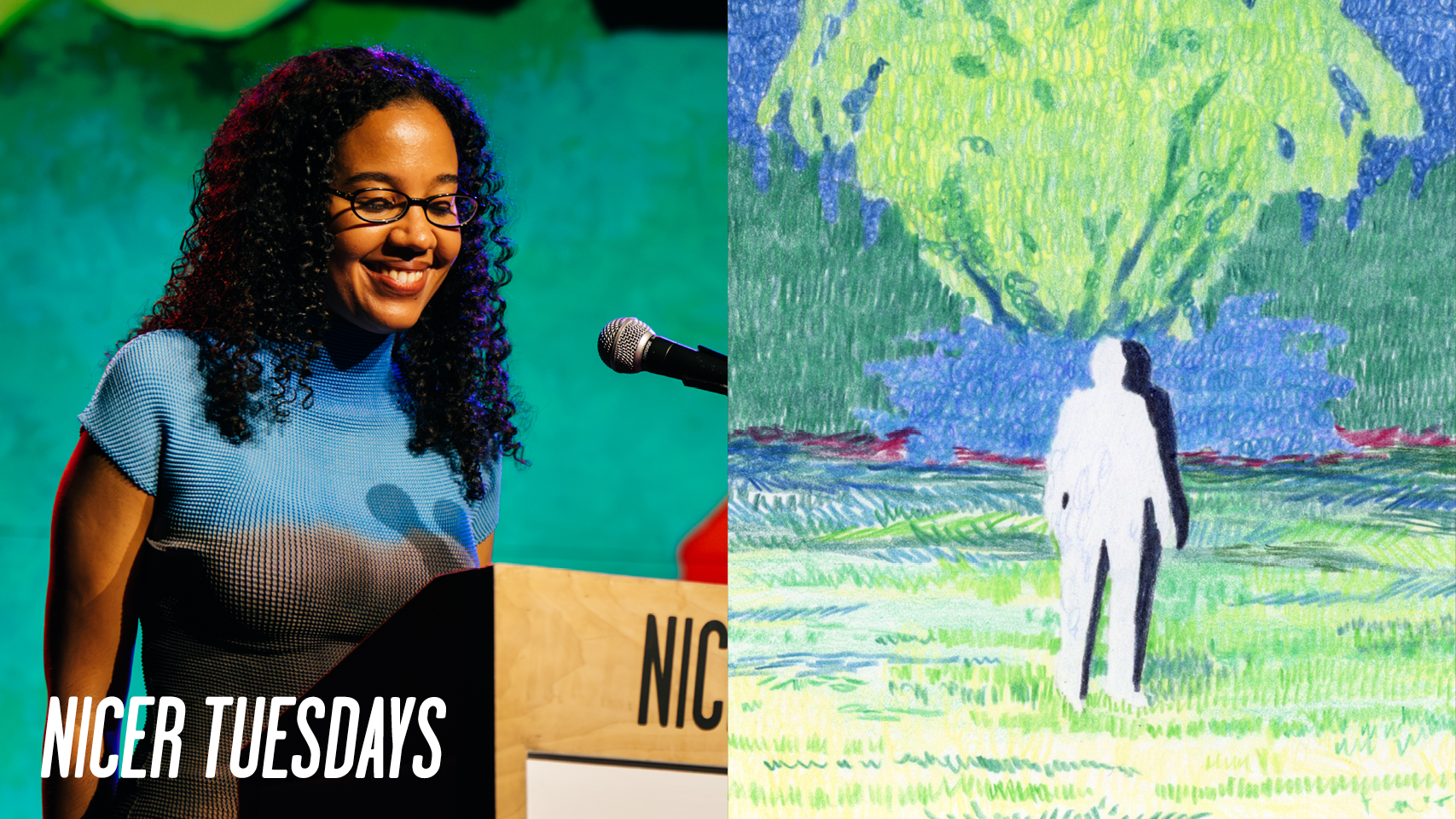
“I did a foundation year thinking that trying everything out would give me a sense of direction and it did the opposite. I ended up liking lots of things.”
[applause] My name's Joanna and this is a big deal. Um, [laughter] tonight I'll share with you my journey to becoming an illustrator, being part of the team behind OE's 180th anniversary film and a zen I developed just over a year ago. Uh, as you can see, I like to work in sequence. I like to have a sense of narrative, but nothing really happens in the work I illustrate. I move through time, rooms and within images.
Sometimes these sequences move and I from my personal practice I then create commissioned work. Um and as some of you might know sometimes it's hard to keep your own voice in commissioned work and also meet the brief. And I feel like in the past year or two I've been able to keep both in a good balance. And these are some of the projects I really enjoyed. Uh to the left is an illustration for the fiction section. I had to illustrate from the wilderness by Yukio Mishima. Steph was the art director on the project. And there's something really nice that happens when you have a great art director where they
push you in a direction you couldn't go towards alone. Um, we created this quiet but very busy room um to depict the feeling in the story. I also got to create a film poster which was risor printed. Um, the film's called Normal Planet and you see characters move through this open air museum. Um, somebody's always asking for the toilet.
If you invigilate, this is the most frequent question you'll get. Um, and another one reflects on life and philosophizes. Uh, another one I got to work on was for Elastic, a literary magazine. I created a comic after CA Conrad's sematic poetry rituals, which was really fun to work on. And then you'll also see the cover of the skinny where one of the riso prints from a residency I took part in was used for the cover.
these to go back in the past. These are two paintings I made in my undergrad back in Brussels. I'm from Belgium. Um I it's really tricky to know where you fit or how to build a career in the creative field. I did a foundation year thinking that trying everything out would give me a sense of direction and it did the opposite. I ended up liking lots of things. I didn't know where to go, how my interests and the world of working and jobs would mesh together. And I ended up doing fashion for a year. Uh, and this was back in Brussels at home.
And I did fashion. And three months in, I thought, you know what, I actually don't like making 3D work. I love 2D. Uh, so I then transferred to my fine drawing department in the same university and started drawing and painting. Uh and I think in the last year I managed to kind of get a sense of direction as to what I was interested in. Uh looking back now I think I still see the quiet uh sense in the work and figures not being fully defined. Um and from there on I did an MA at Edinburgh College of Art in Scotland and got to do a residency right after. So the MA was during COVID, so it didn't feel real.
Um, and I applied to lots of things to make my practice feel real. And this studio here was very real. Um, this used to be an aesthetician's workplace, so she used to welcome her clients and give them beauty treatments. And I wondered, how does she fit everything in because it's tiny. Uh, and after working there for a few weeks, I realized it feels very safe and cozy. So the clients must have loved it. Um, and here I got to develop my own work. Um, it was all about experimentation, learning to use Ryzo and Beth and Johnny who accompanied me through the residency were really helpful in letting me have lots of space
to create, but also guiding me in how to curate a solo show, for example. Um, and so you can see some of the colors here. It was all very blue, my favorite color. And these are the riso prints. I developed um watercolor is a very you have to work with it. You have to work at the right pace. You don't have to you can that's how I do it. U but it's yeah it's very clean and I feel like there's a lot of precision required from me.
Whereas Ryzo is very intuitive. You can print something. It's very costefficient and there it feels like there's not much risk to the medium. And I feel like the combination of the two was really good for me. I uh layered line drawings on top of paintings. I mirrored images. I worked in a new way with new sequences.
I also explored a new color palette. And the beautiful colors that Razo lets you print on uh inspired me to use bolder colors in my watercolor after the residency and embrace abstraction a bit more. And this is a project I got to work on. Um, the animated film for Leeves 180th. 180 years ago in Madrid, a small workshop opened on ABC Cole Street.
Wallets, purses, vanity cases, everyday objects made to ordered by Spanish hands shaped by an intimate knowledge of leather. Before the telephone, before the light bulb, before we walked on the moon, as the modern world was taking shape, a German merchant newly arrived in Madrid, acquired the workshop and gave it his name, Lo, the German word for lion. It was not long before.
So, yeah, this was a big deal for me this year. Thank you. [applause] So, I was on the tram to see my friend who's sitting here and I got an email from someone called Sam Atkin saying, "Are you available? We've got a brief on Monday." And I said, "Yes, as you do when you freelance and you just want to line up the jobs." And I didn't think much of it. And then I had a call with Isabelle Garrett, the art director for the film. And she said, "Love." And I thought, "Oh my god, I have to do really well." Um, and so we had Monday, uh, had Monday to work with the archive and follow a brief. Uh, and I'll show you
more. So, these are all the people on the team. Uh, so Isabelle Garrett the art director, Sam Atkin, the producer, Tom Clos Cole, the other concept artist on the team, and Anna Pescu, who designed the characters. You can also see the list of painters. It took so many people and so much time and so many hands and it was amazing to see all of us work together to make the film. Um yeah so uh the brief started with archives from Lve. So, it was a lot of black and white photos uh with a lot of grain, which to me created a nice gap where the space wasn't defined enough where I felt like I had to repro reproduce it
directly, but um I could inject some of my color palette on my approaches to the archive. Uh we developed a color palette over a few weeks. My own color palette has bright colors but is rather muted and we try to inject as much light as possible. Spain being a bright place and low using quite bold colors.
We move through these arches. They were the frame for the story. Um so these gouache and watercolor paintings were the basis for Lee's uh storefront in Madrid. Uh they would be used as references for set designers and sculptors to create windows with a narrative and to make people want to learn more about the history of Leev.
And Isabelle uh showed me the script and the storyline for the film and we went from there. These are some of the drawings and sketches for the film. Some made it, some didn't make it through. Uh there was a lot of experimentation with color. At one point the film was going to be all green and it is not. Um and yeah I had to it was interesting to work in a team because usually I work quite intuitively. I don't really think of the different steps. Um, but here I had to think of the fact that it would be animated and how many layers of watercolor can I use here? Or how do I make this more effective and keep the
granulation, keep the texture, make the composition interesting, but also think that it needs to be possible to paint x amount of times. And these are my hands on photo booth. I learned a lot about uh leather work um and I mimicked it at home as a reference for all the hands you saw moving earlier.
And these were the final watercolors. Um I worked in a with a set color palette and I think I managed to keep my own voice and also refer back to Leve's archive with a good balance. Um yeah uh and also working with a brand like Leev and depicting a place like Madrid and Spain can be tr quite tricky because um they have a lot of history and they're very distinct.
Um and I feel like I managed to balance my own more quiet watercolors with the richness of their histories. So I would send these when they were finalized and okayed by Isabelle and then a few days later they would move and that is very exciting when you're used to still images. Uh the sound would come together and a universe was fully formed and again really bright colors.
This is the next project I'll be sharing with you. Um I think that working on personal projects and investing in your own practice aside well next to commercial projects is really important. They feed one another and they impact one another. I think that after the project with Lov for example my color palette has changed and I am more brave to use yellows and brighter colors. Um and this project comes um I it was after a period of time where I felt like I was repeating a lot of the same sequences and a lot of the same approaches to the themes I was interested in and I thought how can I approach this um in between
quiet suggested narrative without sequence um and I thought the great thing about funding is that you can make work and it doesn't have to serve a purpose. So when I got Vakma funding from Creative Scotland and the city of Edinburgh, thank you. When I got that, I thought, okay, let's just change my lifestyle a bit. I read a lot. I had a different routine. I made lots of drawings without thinking of where do they need to go?
What's their function? I made lots of bad drawings, which is really important. I made some good drawings that made it to the end. uh and I used pencil and I explored mark making again which I don't think would be productive with a tight deadline and a commission. Um so I tried to find movement through marks. Uh and I think I still managed to have a suggested narrative through bookmaking and mark making and these are some of the drawings that made it to the final zen. Uh I thought of transitions in one space. So, you've got homes, outdoor, indoor, you've got bushes with floating shapes, uh, tree
hollows and abstract sequences. This led to the project with Elastic, the magazine I mentioned earlier, and also collaborations with other artists and uh, Zen Studios here in the UK. Um, so yeah, I'm really happy about the balance between these personal projects and commissioned work. Thanks for having me.
[applause]
Latest Talks
-
Mother Design
Mother Design on why packaging is the only thing a designer can say to the customer
Watch -
Studio Kiln
Can motion design have a “body language”?
Watch -
Lily Kong
How painting offers self-discovery and connection with memories
Watch -
Alfie Whiteman
From professional football to photographing toe wrestling
Watch -
Jazz Grant
Using mixed media as a narrative device for dual heritages
Watch -
Daisy Chain
Reimagining Crack Magazine with slime-inspired 3D motion design
Watch