No Ideas
Why self-publishing pays off
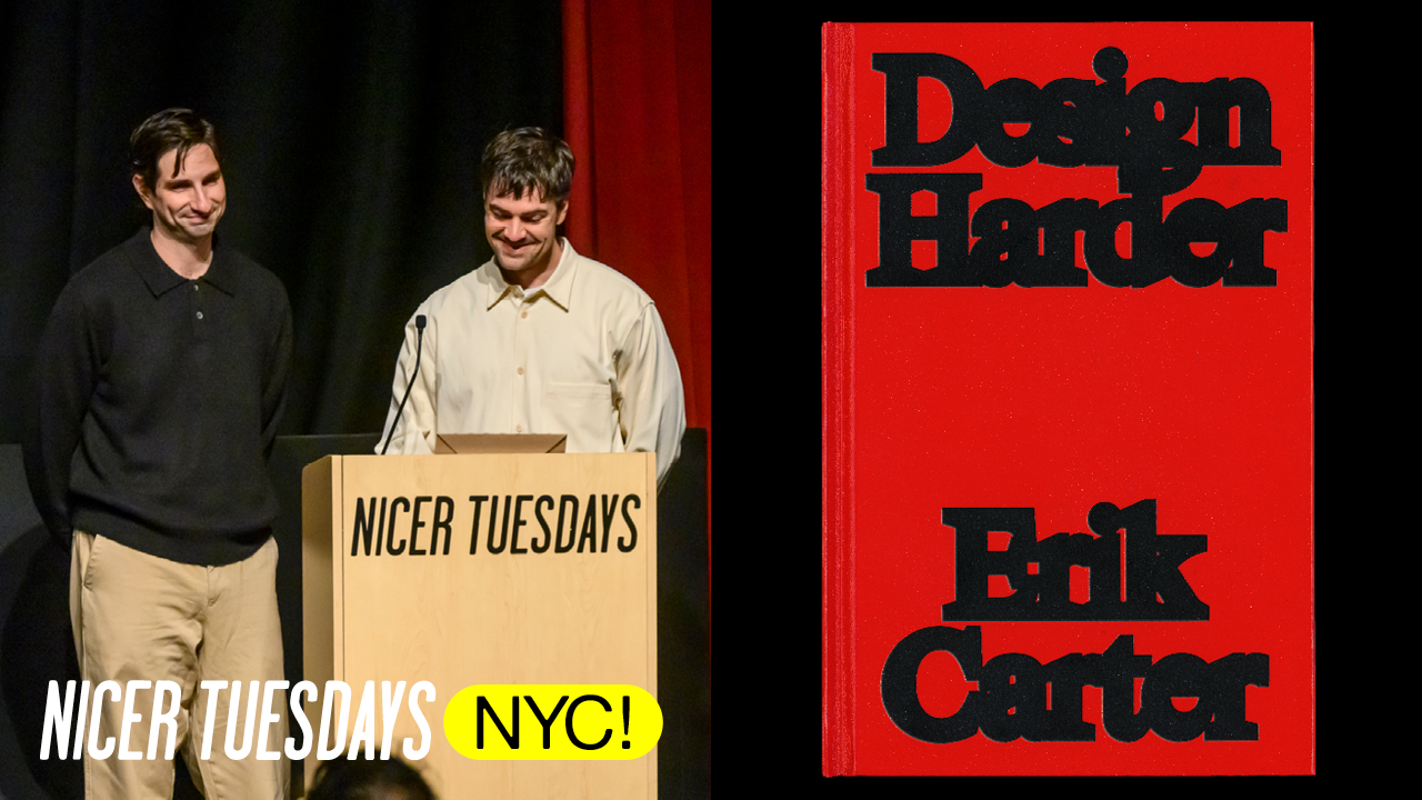
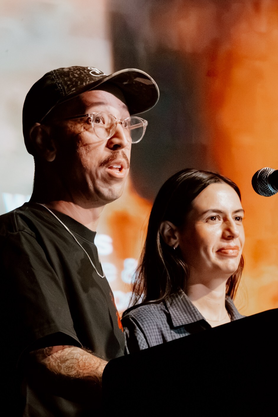
Hi everyone. Uh, wow. Yeah, thank you Elizabeth for the great introduction and for it's nice that for having us. Um, I'm Devin Washburn and I'm Philip DiBello. Uh, we're No Ideas, a small design studio in Brooklyn, New York. We do creative direction, editorial design, art direction, uh, website design, visual identities for commercial and cultural clients. Some of our clients include Verso Books, uh, The Baffler, A24, Art and Dumbo, and more.
Devon and I met at the School of Visual Arts, which is very fitting to be here. Uh, we both took senior thesis with Paul Ser. Uh, it was a really influential time in both of our lives, and it changed the way that we see graphic design. After graduating, I worked with some really great people including Neil Donnelly, uh Jeff Halber and Kyle Blue at Everything Type Company and Kemp Atwood at Area 17. Shout out to those guys. Uh yeah, and after graduating I worked across uh various studios and publishing uh with designers like Rodrigo Carell, Richard Turley, and art directed for places like Lucky Peach and
Penguin Books. Uh so after about six years of working different places, Phil and I decided um it was a the time was up, we should start a studio and we officially opened our doors in 2018. Uh we've been operating the studio for eight years now and over that time we've uh tried to design with intention. Like uh said earlier, we believe that content drives form.
Uh yeah, our process is rooted in research. We make work that is playful, subversive. Uh we just try not to take ourselves too seriously. Uh so we're going to be using the rest of our time to talk about two recent projects. Um and the process for both of those projects and sort of how they differ from one another. Uh we're going to start with uh our first project uh design harder.
We really enjoy designing identities and websites and all the other types of work that we do. Uh but Devon and I have always had a deep appreciation for books. Uh over the course of the studio, we've had the chance to design a lot of different books for really big publishers. Uh and we've really enjoyed that work, but one thing that's always been a bit of a challenge is a lot of the parameters are already kind of set in stone by the time we're brought into the project. And we would often find ourselves in meetings with the publishers asking things like um yeah, can we have a say in um like the paper
that we can choose for the book or something like that? Um they would say no. Uh and we were like, "Okay, yeah, what like the size format? Like maybe we can kind of play with that." Uh no. Um you know, what about the text? Can we help with an organizational system with the content? Can we think about special effects?
Uh, no. No. Yeah, definitely not. So, we started Book Ideas, our own publishing imprint. Our first book was with a designer and friend, Eric Carter. Um, and Eric is known for his illustration work, his book cover design, um, experimental AR filters. He's also the creator of this guy, Flex. [laughter] Uh, yeah. And since 2018, Eric has also been writing about graphic design for places like the Walker Art Center, uh, Dynamo's blog, and also his own Substack, which is also called Design Harder.
Uh, so Eric wanted to bring together his existing writing with some new reflections on the current state of the design industry, and that's what ultimately became the book. With that idea in place, we got to work. So the design process started with a bunch of loose explorations. Uh we started with the cover and eventually we moved into the interior. We quickly landed on something that was starting to feel a little famili familiar.
Uh we noticed a visual pattern and we wanted to explore it further. A lot of Eric's writing is about critiquing the status quo. Uh so we started looking at the visual language of some of the institutions that he's critiquing. Um, as you can see, there's a lot of red and white serif type in the design world.
Uh, so we wanted to like reference that or subvert it in some way. We tried lots of different styles and approaches. Uh, still leaning in that red and white color palette, but we felt like uh keeping it simple was the best option. So, we landed here. Uh, repeated bold text. the idea of stroking the title felt like it was really speaking to Eric's writing. Um, and Eric really liked this, but his one comment was, "He thinks people will think the book is called Design Harder, harder, harder."
Um, which makes a lot of sense. Uh, so we simplified it even further, but we felt like it was still kind of like missing something. U, so then we tried it in black, literally inverting that red and white. And when we all saw this, we were kind of like, okay, yeah, this is this is pretty hard. [snorts] Uh, so stroke text was a central design element for the rest of the book. We reached out to type designer Wei Huang to make a custom version of his type face common serif. Uh, the font has seven degrees of strokedness, uh, one for each act.
Uh, and you can see the system kind of play out through the table of contents and each act kind of gets progressively more and more uh, weighted. Uh, Eric also created these really great illustrations for each essay. And then we also feature type of moments about graphic design from pop culture and TVs and movies throughout as well.
Uh, the book isn't all doom and gloom. Act seven is a call to action. It's 10 points on how we can all design harder and make design and art practice a better place for everyone. Uh when we started book ideas, it was really important to have no barrier for entry. So we also decided early on that we would publish the text online available for free so you can read the whole thing.
So the whole book can be read as an interactive experience at designharder.pub. Um, with apologies to the gather the crowd Adobe guy. Um, these are the final books. We eventually got to the point where we got these from the printer and we were all really excited. Uh, and then they were delivered to our studio. For anyone who's curious, this is what 500 books looks like on a pallet.
And then we packed and shipped all of them. We also had a launch event at index space where we held a Q&A featuring everyone who contributed to the book including Eric editor Aaron Aaron Bites and Desmond and Christina of Authentic and the talk was moderated by Eric Frier. Uh the book also had its skeptics uh which Eric was happy to respond to.
Uh, [snorts] and we realized that ultimately taking the chance of self self-publishing this book uh, really paid off. Investing in a project like this was a really big risk for our small design studio. And we're happy to say that the book found an audience and we quickly sold through all 10,00 copies.
[applause] Um, which leads us into our next project. Um, not long after that, Figma reached out and asked us to design a book for them. Uh, so one taking that chance really did kind of lead into the next thing. Uh, it all started with a Slack message from Alex Prager and Amber Bravo from Figma's story studio. They asked if we wanted to do a book for Config this year. Uh, if you don't know Config, it's this conference uh, by put on by Figma that hosts tens of thousands of people in San Francisco.
Uh we were thrilled to be asked so we agreed and again we got started. Uh our design process starts with casting a really wide net. We try a bunch of different approaches. Most of it is experimentation and then we just kind of notice that a system starts to reveal itself. Uh yes and we do design uh books in Figma.
Uh we showed four different directions each exploring their own production methods and concepts. Uh sometimes we only show one or two options. It really depends on the project, but we were so excited about this project that we couldn't help ourselves. Um yeah, some of these ideas were definitely a little out there, but there was something in each direction that Figma was really responding to. Um so as it goes, it was a kind of a mix of everything. Um the team really liked this uh spiral bindish um effect from direction one. Uh they also like this idea of using multiple illustrators which we were doing in direction two.
And then they also kind of like the type and color palette from direction three. On Figma's side uh more things were shifting from a content perspective. They decided that the zen would be divided into three sections and they also landed on this concept of roundtrip design and that would be communicated with this spiral binding. So the whole idea for the book would be that you can kind of start from anywhere. Uh no section is first. Um many pieces in the book talk about how the design industry is changing. So you can kind of jump into a project at any stage of the process. And this was supposed to be the
physical embodiment of that idea. With this new framework, we got to laying out the book. We flow the text, we defined the system, and we figured out pacing. And this was still all done in Figma. Uh so once we had that structure in place, we started reaching out to artists, u different artists and illustrators, um one for each section.
Uh usually art direction the our process is pretty straightforward. We see some sketches and then we approve some and then we head to final. [snorts] Uh but this project was more fluid. We needed illustrators that could collaborate with us and figure out things in the moment. Uh so we were lucky enough to work with Uda Eisenrich, photographer, uh Pedro Sanchez, and Matia Medvid.
UDA would send us dispatches from Amsterdam. We were on opposite time zones, so she would send us videos overnight and then we'd wake up to these really crazy videos. They were tours of her studio. Um, she was showing us all these different photo sketches and experiments. Um, she was also doing these book mockups and flipping through them and then she landed on all kinds of different props. We kind of really love these slinkies that she found, uh, which are really cool.
Uh meanwhile, Pedro was building a generative tool to create imagery. He was training an AI program to paint based on a set of parameters he gave it. Uh and this process was pretty unconventional because kind of neither one of us knew what the end result was going to look like. Uh and he was basically just sending us live updates uh via text as his system evolved. Uh but we eventually landed on these really beautiful generative floral images and we thought these were really nice.
Matia was quick to figure out all of his illustrations. So we gave him a little bit more time to create these really beautiful animations that live on the online version. Uh so eventually illustrations started coming in uh and we started filling in the pages and we were getting closer and closer to you know a final working design layout.
But the collaboration didn't end there. We were still working well as we were working with the illustrators. We were putting together the rest of the book with the Figma team. It might not be a surprise, but the Figma team really loves Figma. All of our collaboration happened inside of Fig Jam. Uh yes, there are countless pages, frames, uh and frames within frames. Yeah, if you're not familiar with Fig Jam, there's like sticky notes and uh also there are everyone's favorite uh lots and lots of Figma comics.
So, at this point in the project, things were getting pretty wild. Um there was a lot of moving parts, a lot of people were involved and um everything was becoming very collaborative. We were literally living the concept of the book uh roundtrip design. content was being changed out, rewritten and reorganized.
The design system was evolving and art direction was happening all at the same time. Uh for the covers, we went through a lot of different iterations. Uh some were purely typographic, others we were trying to incorporate the illustrations from the book. Um eventually we realized that the covers really needed artwork on there, but it needed to feel more ingrained. One dispatch from UDA showed her exploring some of the objects floating on the cover and this video just kind of like blew our minds and it unlocked something.
Uh so with that idea in place, we came up um with this idea of giving them all the text covers and having them draw around it. So this is also Uda's Pedro and Matia's sections. Um and everyone was really loving it. But the collaboration didn't end there. more collaboration. Uh we also worked with our printing partner Hemllock who also navigated our tight timeline, budget, paper and production considerations and these other bumps along the road. Uh yes, real time remote collaboration happened with Phil on press in Canada and then us and the Figma team um press checking via Zoom call um really getting into the
details and then we worked with Ian Shyiver to document the book as well. Um, we wanted the photo shoot to capture this start from anywhere idea. Uh, and Ian knew just the trick. Uh, which involved gluing all of the pages in the book together one by one. [snorts] Um, which worked out because it came uh, yeah, finally we brought the round trip design to life. Um, and the pink spiral was what made it all possible. Um there's this great section in the book where Uda's objects u are featured and it was just a great um playful moment about interactive design and then Pedro and Matia's illustrations really yeah just
shine throughout the book. There are also some other fun details. There's a data section and there's also this foldout poster that features every object UDA used in her photographs. So they're all kind of cataloged in an indexical way. Uh, and then one of our favorite details is we rotated the page numbers throughout. So if you flip through, um, it echoes that round trip design once again.
Okay, so we're almost finished. Um, we promise. U, so we want to talk about how these books were different from one another. And when we're looking at design harder on paper, it seemed like a pretty straightforward process. Uh, we showed one direction, everyone was on board, we plowed ahead, and we just made it happen.
Yeah. I mean, we're leaving out all the hurdles like distribution, shipping, sales, tax, customs, but you get the idea. If Design Harder was a straight line, Figma was a little different. Um, it was a process that could have only happened today. And it's kind of thanks to like the program that they make and the way that we could collaborate with people all around the world.
So rather than a straight line, it was truly a collaborative effort. Uh lots of twists and turns that ultimately made the project much stronger. Uh and everyone really loved it. Uh okay. So what did we learn? We learned that [snorts] every project is different. You have to adapt to what's happening in front of you. Uh also just put yourself out there. Uh taking a risk on publishing the book kind of led to another project. Uh essentially if you build it, they will come.
and always trust the process. Thank you so much
Latest Talks
-
ilovecreatives
“You’re not scattered, you’re multidimensional”: Own your slashiness
Watch -
Bill Rebholz
Taking ‘trash’ and turning it into beautiful vernacular signs
Watch -
The New Company
Why brand relevance is driven by novel ideas | The New Company
Watch -
Tala Schlossberg
What one year of committing to making more of what you love can do
Watch -
Arsh Raziuddin
How design can become a unifying language
Watch -
Mona Chalabi
Making sense of the unmeasurable
Watch