
Arsh Raziuddin
How design can become a unifying language
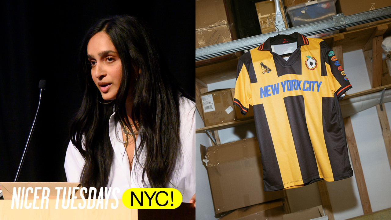
Hello, I'm Arsh Raziuddin. I'm a creative director and designer in New York. Um, I design a pretty wide range of projects. I've worked in editorial. Um, I design a lot of books and interiors. I work on films and identities, and I've helped design a magazine from scratch. And most recently, I worked on New York City's World Cup um campaign. There's a visual sensibility that goes and you can see throughout the most of my work and but I've never really wanted to work on one specific thing.
I actually think being a good designer and especially good creative director is being able to bring the same level of thinking to completely different problems. A book cover and a city campaign shouldn't look the same, but the thinking behind them should be just as rigorous. As my career grew, the idea of access grew with it. Who gets to make the image? What happens to the image after it's in the world? Who does it become and how does a viewer interpret it? And throughout the presentation, I'm going to be talking about some of those questions that I'm constantly asking myself. I spent a lot of my career working in editorial, and editorial is Chapter 2: Editorial and history
where I learned that language gives um that design gives language a point of view. You can read a headline and understand the words, but still not totally understand the tone of something. And then you see the image and suddenly it's funny or it's sinister or it's sad. And the image gives you a way into the language. But it can also change the way we picture something we thought we understood or we knew, and it gives people who might have zero context about a subject or that are reading an article a new way of approaching journalism. Like my mom, who now sends me this weekly, "This illustration is so good." Thanks. A shout out if these are you cuz they're art the approved. Um
Take for example my work uh from the Atlantic. So, I design features monthly and this one here I worked on a story by Adam Serwer called the new reconstruction and I reconstructed the original artwork of the 14th Amendment of that of 2020 and George Floyd's murder. And I was often dealing with a visual record and history that had been pictured for more than a century. So the question here becomes can you make history can you take history and make it new again?
Can you make an image um Can an image make you look at something familiar completely differently a century later? When I worked on the prophecies of Q, QAnon had already created a completely insane visual universe of its own and we had memes and conspiracy diagrams and American flags and screenshots and trolls and garbage.
And the question became how do you make an image about a world that is already drowning in images? And how do you make someone stop and understand what they're looking at? And that leads to me thinking about commission as a creative director and how incredibly important it is. Chapter 3: Commissioning perspectives Give the same story to five illustrators and you get five completely different points of view. So art direction isn't just choosing the image or getting the final you're choosing the point of view that the reader is going to access the words in. And eventually I became as invested in who
gets to make the image as the final image itself. And that meant wherever I was working or whatever client I had my main priority was bringing in a new artist, expanding who we commissioned and thinking about where the stories were that we were putting our resources behind. And when designing Chapter 4: Book cover strategy a book cover it has to make you interested in a different way. You have a plain 6 by 9 um rectangle to fill in with no logo um some text but you never really know what you're going to get.
Depending on the prompt or the idea behind the book you could be designing something universal or something completely specific and both are equally as hard. It might be a tiny object from the book, a phrase, a cultural reference, um but something that most people walk right past until you find the right reference and someone sees it from across the room and it resonates, you know you've made something successful. And I work with a lot of South Asians and Arabs and Muslims and black writers and that's made me very aware of how quickly that culture can turn into shorthand and whether it's publishing or editorial,
India becomes a lotus, Islam becomes an angry man, Arabs have a kaffiyeh and we have this enormous visual vocabulary of images that are available to us and somehow we keep reaching for the same five images even in 2026. So, when I'm designing covers, I'm always curious about how we approach things differently and if we are going towards the same imagery, how do we flip it on its head?
Take for example this cover by Mosab Abu Toha that I designed, A Forest of Noise. Mosab is a poet who left Gaza in December of 2023 with his family and when I was designing this, I was very conscious of not wanting to reduce the book cover to um an image image of genocide or war. And I ended up making the one on the far left um as the final. And it's bloody, but it's also growing into a tree and after the book came out, the writer Iman Mersal wrote about the cover. And at the end of her review, she says, "When you reach the last words, close the book, turn it over, imagine the hand on the cover is the poet's and clasp it." And it made me emotional to read and curious about how
another person can bring something to your design work that you wouldn't have put there yourself. And once you put design into the world, how it's no longer yours to interpret. This is another book where the problem was almost the opposite. How little does an image need to do? Knife is Salman Rushdie's memoir about surviving the attack that nearly killed him. Chapter 5: Minimalist design impact And the obvious imagery was all terrible. Blood, weapons, violence. And I didn't want any of that. I wanted um something that was calm and collected, and I did more than 50 versions, and eventually we went back to the first. Which is one cut replacing the I in knife, and that was it. It was the letter, it was the wound, it was the title all in one.
And the one mark ended up traveling across 25 different countries. Even in designs that doesn't really make sense, but then Alex Gibney made it into a documentary called Knife that is out this week, and the same mark moved from uh book cover to film. And I think that's the thing about design. When you get it right, it can take totally different shapes and new forms. Acacia is a political and cultural magazine made by Muslims. Uh Chapter 6: Building community the magazine was named Acacia based on the stories that the Prophet Muhammad would gather around an acacia tree to rest and to be with one another.
And I was very aware that I didn't want the magazine to look like what people expected of a Muslim magazine. I wanted it to be strange and beautiful and angry and messy, like all of the people who were making it. And because it was ours, we could decide who got commissioned. We could bring in established artists like Cassina Modah, and also people who have never been given the opportunity before. We could decide what deserved a beautiful photograph, a license, a commission, 10 pages, an illustration, or a tiny doodle in the corner. We could have fun.
And we could tell stories that hadn't been told before by us. But eventually, the magazine stopped being just a magazine I designed. We started doing readings and launches and had conversations, and writers met artists, artists met organizers, people made friends, people met partners. And the object that I designed became a reason for people to be in the same room together. That's an important thing to remember sometimes that design isn't the final thing. It's a thing that gets you to the thing. And that started making me think about what I was more interested in as a designer and creative director. Not just does this image communicate something, but what does it contribute to and what happens around it.
This year, I was asked to design the New York City's World Cup campaign, and I really had to think about what does that mean to New York City and what has been done Chapter 7: NYC World Cup campaign already. So, I looked at the mayor's campaign visuals, I studied Anish Bhupathi's designs, and I figured out what was missing and what was lacking and like what images we didn't show.
So, we have the taxis and the Statue of Liberties and the subways and the pizzas and it really was all covered. So, I had to think about how do I make something different from that. [snorts] And this was for the World Cup, so it had to feel like New York, but it had to feel like soccer. It had to feel nostalgic, it had to feel digestible for a 9-year-old and a 95-year-old. It had to be for someone who's obsessed with soccer and for someone who doesn't know what offside means.
And basically, we landed here, the very complex idea of an apple and a soccer ball. And although it was executed well, if I say so myself. It became much more interesting to me after the design process. [music] [music] [music] We started by designing the key art and creating a system that could be broken down and digestible to all the New Yorkers participating in the campaign. We made stickers of all the borough flags that were used on almost everything the campaign touched. We made gifts and animations.
We were on taxi marquees. On cups that you could purchase in every borough. It ended up on posters that you could buy in the city store. On patterns that we used on water bottles, on bandannas, on video series in Times Square, on bus stops, pickup games at Gracie Mansion, sanitation trucks, signage across the piers, the markets, and museums, on the LinkNYC screens that provided free games to all of the New Yorkers on banners across town, at the games that the raffle winners won and attended, to this cute ass kid, on the subways, on our nails, at more than 100 free watch parties all across the five boroughs.
On the fields that were open all night to play soccer at JFK. And on my favorite, the ferry. And whoever made this flotilla gang video needs a raise. And then we made these god damn jerseys. Chapter 8: Impact and legacy We worked with family-owned manufacturer, shout out Mazzi, in Brooklyn and sold them at an affordable cost. And people lost their minds and the caption drove everyone crazy and they kept selling out. And I was getting hate DMs and bribes simultaneously.
Someone said that they would let me stay at their hotel in Bali if I got them a jersey. Um and I saw an unlimited amount of TikToks and videos that made me laugh. This cheeky that I'm not getting. No sir. Is it good up in the I-8? No sir. Put some miles on that [ __ ] No sir. And don't forget to grind on a [ __ ] show.
Back here in New York City with the one and only Paul Pogba and I'm so excited to be presenting him with our New York City official World Cup jersey. We're so thankful to have you in our city. These are my creeper photos from the nights in Knicks one. And like so many people were stopping each other to take photos together and that's the part that made me happy and the part I cared about that people were wearing it. They cheered in it. They shared it. And people stood in line for hours. I think the earliest was 1:00 a.m. according to Twitter and someone told me a story about how they met someone on the street in Fort Greene who have the same jersey as them and then they like got a beer. Um another woman told me she has a group chat with the people she
stood in line with all day and now like every time something drops, they text each other. And I think at some point I stopped caring about whether someone thought the design was good design um because it didn't matter at that point cuz it was moving people in ways far beyond the design itself. And I think that's probably what connects all of the things you just saw for me um that an image can help you understand a sentence, design can help you look at history differently, the right campaign art can bring an understanding amongst a very diverse group of people.
And design can galvanize people. It can um give something that's difficult to name and make it immediate. It can become a language between two people who didn't have it before. It can be shared and worn and passed and read and I think whatever the project might be, that's the kind of design I want to continue doing. Thank you very much. [applause] [cheering]
Latest Talks
-
ilovecreatives
“You’re not scattered, you’re multidimensional”: Own your slashiness
Watch -
Bill Rebholz
Taking ‘trash’ and turning it into beautiful vernacular signs
Watch -
The New Company
Why brand relevance is driven by novel ideas | The New Company
Watch -
No Ideas
Why self-publishing pays off
Watch -
Tala Schlossberg
What one year of committing to making more of what you love can do
Watch -
Mona Chalabi
Making sense of the unmeasurable
Watch